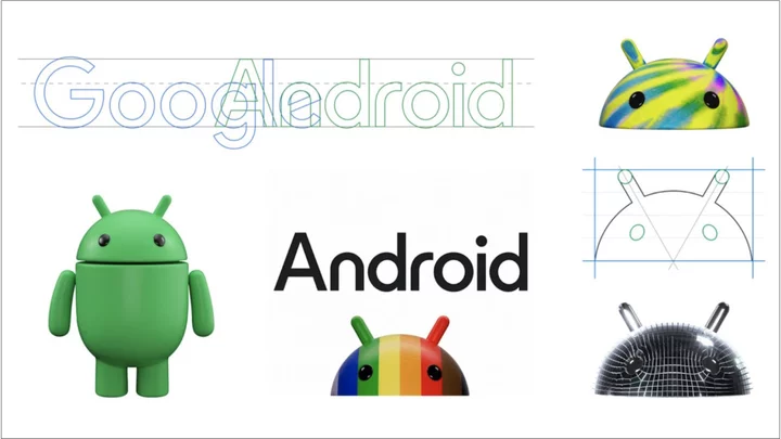
Recreating Google’s Android logo now requires two new ingredients: the Shift key and some shading. The company announced the logo makeover today in a post that reveals a more three-dimensional look for the familiar icon and capitalization of the formerly lowercase word "Android."
The visual results evoke the Simpsons episode that turned Homer into a 3D being.
“The bugdroid — the face and most identifiable element of the Android robot — now appears with more dimension, and a lot more character,” says Jason Fournier, director of Android consumer brand management. “We've also updated the robot’s full-body appearance to ensure it can easily transition between digital and real-life environments, making it a versatile and reliable companion across channels, platforms, and contexts.”
This is the first time Google has redone its Android branding since a 2019 tweak that saw it retire dessert-based Android names like Oreo and Pie in favor of simply numbering them.
People should expect to start seeing the redesigned visuals on Android devices (presumably including the boot screen that has traditionally flashed the bugdroid icon) later this year.
Android users also have a new set of AI-influenced features and options coming their way in a quarterly “feature drop” the company revealed in a separate post. Among the changes due:
The “Assistant at a Glance” home-screen widget will now employ an unspecified sort of AI to cycle through updates about things like the weather, travel plans, and future events.
The Lookout app that Google launched in 2019 to generate text descriptions of images for people with impaired vision will use AI to answer questions that users can ask about an image.
Google Wallet, the payment-and-credentials storage app that Google shipped with Android 13, gains a photo-import option that will let you bring in a pass with a barcode or QR code, such as a library card.
Android Auto will let you join Webex and Zoom calls while on the road (which we realize not all of you will regard as an upgrade).
If you use a Fitbit or the Google Fit app to track your sleep, you can ask Google to recap those shut-eye stats in your morning personal routine (which we realize that new parents and travelers in the throes of jet lag may not regard as an upgrade).
This bundle of features, unlike some of Google’s past feature drops, isn’t specific to its Pixel devices and so should be coming to most Android phones via Play Store and Google Play Services software updates starting Tuesday.

